Thursday, October 19, 2006

Principal Componants Analysis on the Phase Response Curve Data

Problem

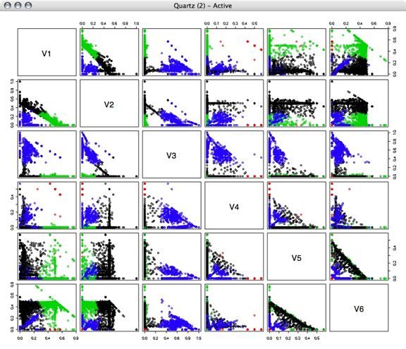
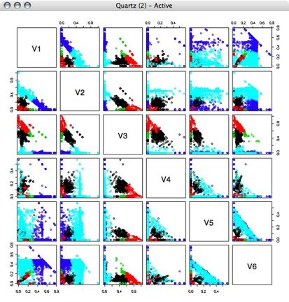
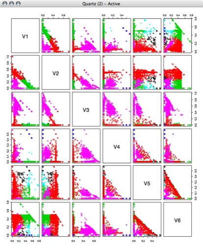
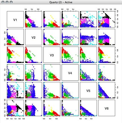
We are interested in finding out whether there are a finine number of distinct behavior types within the phase response curve (PRC) data. We used the 10 time points of the data as the 10 "features" or dimensions of the data. We decided to use principal components analysis (PCA) on the data in order to reduce the dimension of the data to something that would be easier to work with.

Wikipedia gives a concise description of PCA:

In statistics, principal components analysis (PCA) is a technique that can be used to
simplify a dataset; more formally it is a linear transformation that chooses a new
coordinate system for the data set such that the greatest variance by any projection
of the data set comes to lie on the first axis (then called the first principal component),
the second greatest variance on the second axis, and so on. PCA can be used for reducing
dimensionality in a dataset while retaining those characteristics of the dataset that
contribute most to its variance by eliminating the later principal components (by a more
or less heuristic decision). These characteristics may be the "most important", but this
is not necessarily the case, depending on the application.

A good paper and matlab tutorial for PCA is written by Jonathon Schlens.

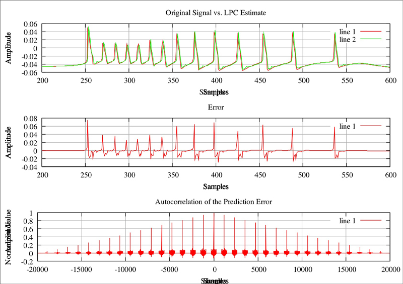
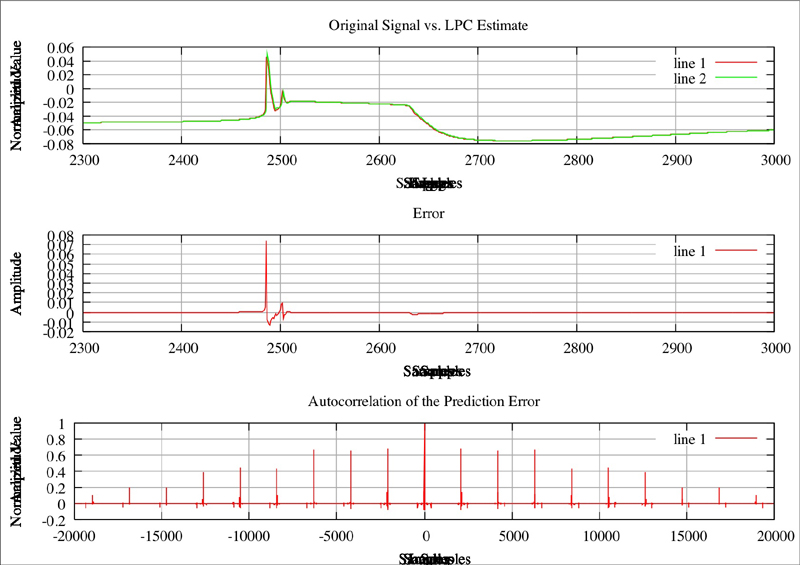
By using principal components analysis on the data we were able to reduce the dimensions from 10 to 2 while still preserving most of the variance. This allowed us to then re-project the data into two dimensions and look for large groups of similar behavior (results below).

Next we intend to try some clustering algorithms on this data in order to define the areas that have a lot of similar behavior and then use them with John's dimension stacking tool to see whether the prominantly similar areas of the PRC behavior are interestingly distributed in conductance space.

Technique and Results

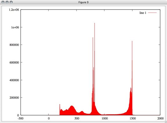
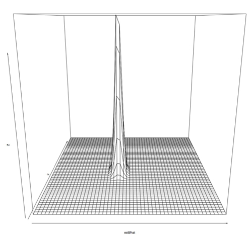
First, we ran principle component analysis on the entire PRC set. Variance was very high, but this included outliers outside of the -1 to 1 phase shift that the PRC data is supposed to contain. We projected the data using the first 2 principle components, and made a plot showing how many samples were at each point. Using a single principal component we would have been able to preserve 92% of the variance, while using the first two principle components preserves 96% of the variance. (Adding the 3rd component brought the variance preserved up to 97% and the preservation continued to increase only slowly until 100% was preserved with all 10 dimensions) However, since we had a few outlying points as far out as -1000 and 700, this representation wasn't very useful:

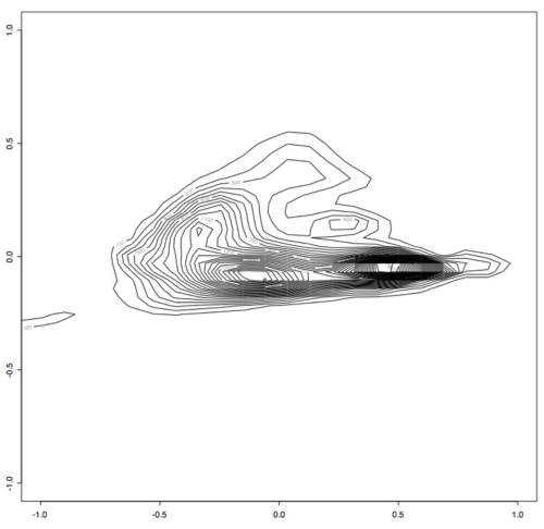
Next, we filtered out any of the original data that contained points outside of the perscribed -1 and 1 range and ran principle component analysis on this slightly smaller data set. This produced smaller variance as expected, since the data was all within a much smaller range. Again using the first two principle components, we projected this data into 2 dimensions and made several plots that show how many samples appear at each point in 2d space. [I am computing the variance preservation and will add it soon.]

This is the R code I used:
> x <- read.table("~/Desktop/smallsignals", header = TRUE)

> est <- bkde2D(x, bandwidth=c(0.1,0.1))

> contour(est$x1, est$x2, est$fhat)

Which produces this contour plot:

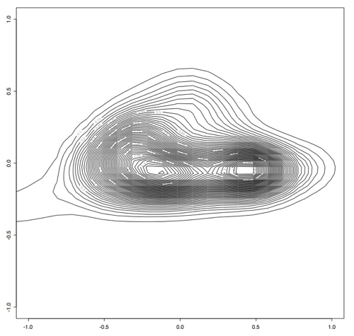
As you can see here, there seem to be two main "types" of PRC behavior. One of the next steps will be to find out what's in these two areas that makes them so distinct.

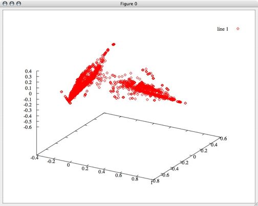
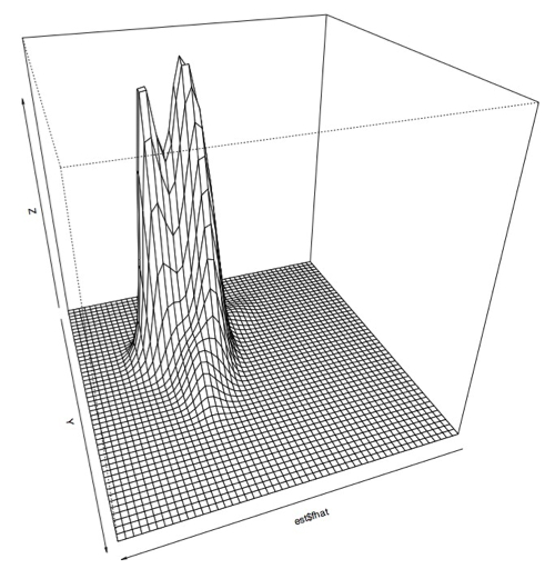
I also plotted this data using a 3D perspective with this code:
> persp(est$fhat)

Which produces this sort of plot:

Zoomed in:


Another angle:


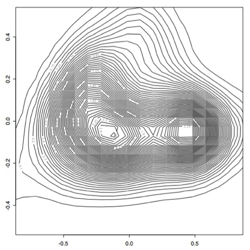
However, it became apparent that the [0.1,0.1] bandwidth that we used to begin with did not capture all of the peaks exactly because there were some smaller peaks. After experimenting with several bandwidth sizes varying between 0.1 and 0.000001, it became apparent that the plots did not change much once you made bandwidth smaller than 0.001, so I decided to use this as the "best" bandwidth size for this data.

As you can see, the data has a slightly different shape:


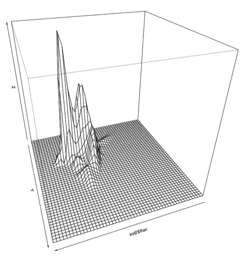
I think there may actually be more like three or four different classes, but only two very large classes.

Results Analysis

The next thing I wanted to do was see what exactly was represented by these high density areas that we have been assuming are "classes" of PRC behavior.

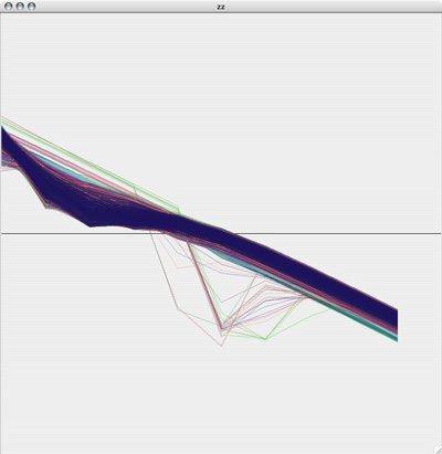
Plotting several hundred thousand of the PRC plots by themselves gives you a plot that looks a lot like this:


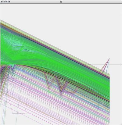
Kind of pretty, but not very useful. So the next thing I did was write a quick and dirty octave script to make collections of PRC plots that fell into these two ranges. The boxes are just eyeballed in a graphics editing program, so they aren't the last word in accuracy, but it let me at least get an idea of the area:

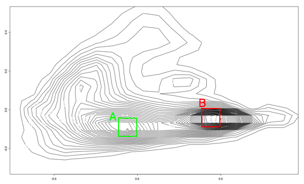
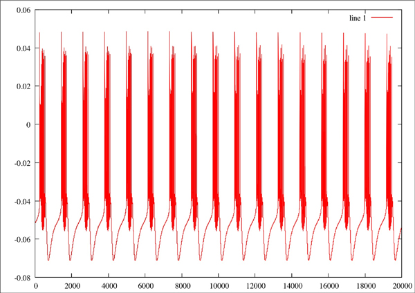
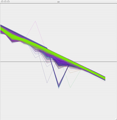
The plots from the "A" area all plotted together look something like this:

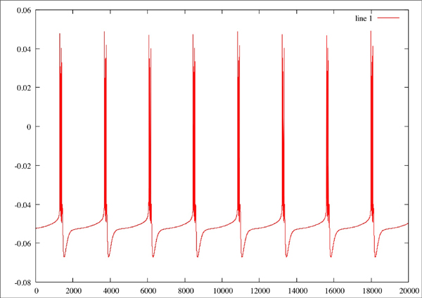
While the plots in the "B" region look like this:

To get a more accurate idea of how separate these two groups are, I colored the A plots green, the B plots red, added some transparency and overlaid the two graphs so that we could see where these plots are in relation to each other:

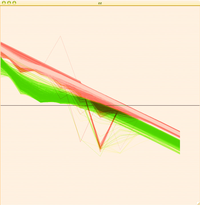
I am pretty pleased with the separation of behaviors, considering that this is just a first pass. Hopefully with some clustering we'll be able to get some more acurate separation of behaviors than I am able to get by hand.

Linear Predictive Coding

Once I had Octave up and running, and was able to install an implementation of the LPC, I was able to run the LPC algorithm on a few simulated neuron plots. I tried this with the period length for P, but found that using 10 (which is standard for audio processing) actually works better.


Original plot of neuron where Na=2.3, CaT = 3.33, CaS = 3.33, A = 3.4, KCa = 2.1, Kd = 4.2, h = 5, leak = 2
Red line is the original plot, green is the estimated:
Original Plot of neuron where Na=2.3, CaT = 5, CaS = 0, A = 3.4, KCa = 2.1, Kd = 4.2, h = 5, leak = 2
Red line is the original plot, green is the estimated:
f nOriginal plor of neuron where Na=2.3, CaT = 3.33, CaS = 0, A = 3.4, KCa = 2.1, Kd = 4.2, h = 5, leak = 2
Red line is the original plot, green is the estimated:

Mining Activity Patterns of A Single Neuron Using MinMax Values

I worked with the vectors of MinMax data from Astrid's database. These contain all of the minimum and maximum points for three periods of each voltage trace (or 1000 points of the non-periodic models).

Binning the Voltage Values

First I plotted a histogram of a random sampling of 0.1% of these points to get an idea of whether they were equally distributed in voltage space or not. Surprisingly, there are sharp peaks throughout the voltage rather than an equal distribution.

In this graph, the x axis is voltage and the y axis is the number of points found at each voltage.

Next I performed kmeans clustering on the points to create bins for the voltage values. This allowed me to come up with a discritization of the voltage values. For simplicity's sake, I started with a relatively small number of bins. I decided to use 6 bins for the voltage values.

This image is of FIVE bins, not 6. I'll be putting up the real image soon, but to give an idea this graph is a dummy value on the x value for plotting purposes, and the voltage points are plotted on the y axis colored according to the cluster they belong to:
Once the data in my training set was assigned to clusters, I was able to use that data to find the boundaries of the clusters. I wrote a brute force MatLab function that went through each cluster to find the highest and lowest value in each cluster. Column 1 is the number of points in that cluster, column 2 is the minimum value in the cluster, and column 3 is the maximum value.

In Cluster 1:  174158 0.039213 0.073395
In Cluster 2: 32334 0.019467 0.039213
In Cluster 3: 20602 -0.0058785 0.019465
In Cluster 4: 189199 -0.034651 -0.0058841
In Cluster 5: 131339 -0.059631 -0.034652
In Cluster 6: 129368 -0.079999 -0.059631

Discritizing the MinMax plots

Next, I used these values to write a java method that goes through astrid's database and discritizes all of the MinMax Vectors. For example, this model (where the second column is the voltage value for each point):

996018
0.000000e+00 4.974533e-02 1 -4.838973e-02
6.300000e-03 -1.097534e-02 0 -4.823223e-02
1.110000e-02 -9.882242e-03 1 -4.811223e-02
1.026000e-01 -7.579889e-02 0 -4.703479e-02
7.241000e-01 4.974689e-02 1 -4.701274e-02
7.304000e-01 -1.097532e-02 0 -4.685524e-02
7.352000e-01 -9.882236e-03 1 -4.673524e-02
8.267000e-01 -7.579889e-02 0 -4.565805e-02
1.448200e+00 4.974609e-02 1 -4.563577e-02
1.454500e+00 -1.097523e-02 0 -4.547827e-02
1.459300e+00 -9.882241e-03 1 -4.535827e-02
1.550800e+00 -7.579889e-02 0 -4.428133e-02

becomes:

996018  6 3 3 1 6 3 3 1 6 3 3 1

Creating Feature Vectors

Next, I reduced this even further by creating a vector for each model that contains the percentage of its points contained in each voltage bin. This meant that every model was then described by 6 numbers, each one a percentage value so they could be compared to each other.

Thus, the above model became:

0.25 0.00 0.5 0.0 0.0 0.25

Because 25% of it is made up of 1's, 0% of 2's, 50% of 3's, 0% of 4's or 5's and 25% of 6's.

A First Glimpse Through PCA

First I performed principle component analysis on this data to see if it could be reduced even further, but all 6 dimensions turned out to be pretty useful. Even so, after transforming the data based only on the first 3 principal components, we can see some clearly defined separation between groups. My hope is that by using all 6 dimensions, we can get some even clearer distinction and more groups.

More Detail With kMeans

Next, I performed kmeans clustering on the percentage vectors, using several different numbers of clusters.

4 Clusters:
5 Clusters:
6 Clusters:
7 Clusters:

Looking at this now, I think we might be able to get even better classifications by putting the data into a better projection, but I haven't done that yet.

Building Rules to Classify Models

My next step was to choose one of the clustering assignments (I chose the 7 clusters assignments) to find out what defines each cluster. Using a similar technique to the one I used to determine the binning boundaries for voltage (above), I found the boundaries for each cluster for each of the six "features."

For each cluster, the rows indicate the voltage bin, the first column indicates the lowest percentage boundary and the second column indicates the highest percentage boundary for each bin. For a quick pass, I used these to create rule sets to assign labels to the data rather than defining the linear boundaries. This approach was able to assign labels to roughly 80% of the data.


cluster 1:
0.16456 0.50000
0.00000 0.38298
0.00000 0.04167
0.00000 0.03571
0.30000 0.57143
0.00000 0.16667
cluster 2:
0.02273 0.37410
0.25000 1.00000
0.00000 0.18750
0.00000 0.57143
0.16667 0.57143
0.08571 0.57143
Cluster 3:
0.23077 0.76923
0.00000 0.31579
0.00000 0.06250
0.00000 0.05000
0.00000 0.22652
0.22917 0.76923
Cluster 4:
0.25000 0.57143
0.00000 0.00000
0.00000 0.00000
0.42857 0.57143
0.00000 0.00000
0.00000 0.25000
Cluster 5:
0.39550 0.76923
0.00000 0.22186
0.00000 0.03846
0.00000 0.16667
0.15714 0.46154
0.00000 0.25658
Cluster 6:
0.06250 0.57143
0.00000 0.07722
0.31579 0.87500
0.00000 0.10000
0.00000 0.06122
0.12500 0.52632
Cluster 7:
0.03774 0.30769
0.00000 0.57143
0.16364 1.00000
0.00913 0.57143
0.00000 0.33333
0.04110 0.21053

I ran a preliminary classification on the database using these clusters

Fall 2006 Independent Study

This fall I am doing an independent study of techniques and literature in data mining. For starters, I'll be looking at techniques for linearly separating classes of data. I'll focus both on classic problems from the text (I'm going to be using Pattern Classification, Duda, Hart and Stork, 2nd Ed., as well as the accompanying computer manual) as well as trying out appropriate techniques on a data set used in our lab.

Before starting on current work, I'll post several entries detailing some of the techniques I tried last year while working on my honors thesis.